What does your lunch rush look like on a Monday? What about on a Friday? Are you overstaffed at 7PM on a Tuesday? Easily understand the data you are collecting with Heat Map panels in Loop Insights.
Use Heat Maps to visualize the relationship between quantity of customer responses and sentiment over days and times in one easy-to-read panel.
In this blog we are going to explore what a Heat Map; is, how it’s useful for displaying your customer experience data and how to effectively understand the insights.
What is a Heat Map?
Simply put, a heat map is a way to visualize density in a data set. This can be everything from quantity of data collected and sentiment over a specific time period. Heat Maps can use visuals of blogs or bubbles, using colours to identify trends in the data.
What is the Benefit of Using a Heat Map for Customer Experience Data?
Let’s imagine you’re running a restaurant. You use a traditional bar graph to determine the customer sentiment each day of the week and another graph to view volume of responses. Then you compare the data to make business changes, such as staffing, employee training and procedures. Both volume and sentiment data are important in this case. To really understand the story your data you need to know how many responses you received and the sentiment associated. For example Monday 10 responses, 2 negative and 8 positive vs. 1 negative and 0 positive. This can impact how you handle the feedback and determine if there are outliers or an issue in the business that needs addressing.
Now understanding the story of your data can seem complicated that way.
That’s where Heat Maps come in.
With one reporting panel, you will be able to see the quantity of data received (size of bubble) and the sentiment of that data (colour of bubble). This will allow you to hone in on critical issues first (large red bubbles), and understand where you are exceeding expectations (large green bubbles).
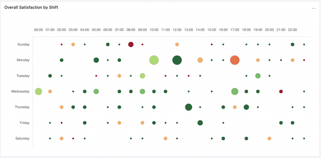
These Heat Map reporting panels in Loop Insights, allows you to quickly scan your data based on time of day and day of the week and understand which shifts may be having issues and which employees should be rewarded.
How to Read a Heat Map
Heat maps give you an at-a-glance understanding of the overall data that you’re collecting. They are intuitive to read, that members across the organization can understand what the data is telling them. The red colours indicate a problem, whereas the greens indicate success in either data collection or sentiment.
Organizations are busy and operators, managers and executives don’t have time to dig deep into the analytics to have an understanding of what changes need to be made. Heat Maps makes the collected feedback easy to execute on.
When to Use the Heat Maps Reporting Panel
Using Heat Maps to report on your data by shift make it easy to understand how much feedback you’re collecting and the overall sentiment of that feedback by date and time. Instead of using multiple graphs to display the data, you can see it all in one easy-to-understand panel with Heat Maps.
Learn more about how to use Heat Maps in Loop.