The Loop Experience Platform is excited to announce a new feature release that will help organize the actionable insights from the data you collect from your customers.
After you have closed the Loop on the customer experience through collecting data and engaging the customer using real time feedback channels, it’s important for your operations team to analyze and automate areas of the customer journey to improve the overall customer experience. Covering reporting from NPS, CSAT and CES survey data you can identify trends and sentiments of the customers through various touch-points in their customer journey.
This is where dashboards can be very helpful.
In this release, you will be able to build your own custom dashboards by dragging and dropping actionable data to display it in a meaningful way for various levels of the organization.
What Can I Customize Dashboards to Show?
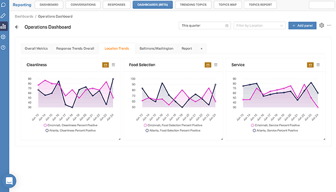
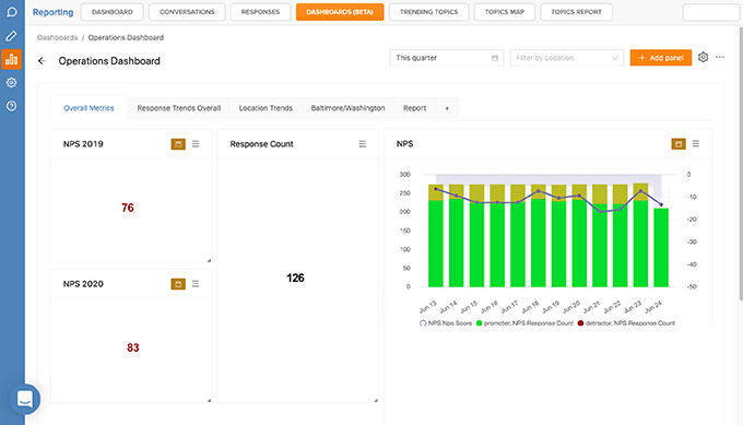
Building customized dashboards for different levels in the organization increases operational efficiencies since the actionable data is reaching the right audience. This includes a high level overview for management meetings, to specific data sets like locations data which will help pinpoint areas for improvement at a glance and analyze trends.
Each dashboard is a collection of pages and panels which includes charts and graphs to visualize all customer experience data collected by the Loop Experience Platform.
Dashboards can be comprised of multiple pages to showcase different collections of panels at a glance. Dashboard filters can be put in place to identify trends over a specific period of time including 30 days, last 7 days or a custom date range. Add further simplicity by having dashboard filters apply to all panels contained within the dashboard.

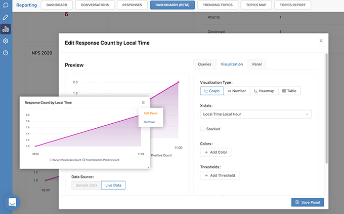
Panels can help you visualize using a line graph, bar graph, table, heat map or number, with specific data defined by a set of criteria from filtering. Panels can support one or more filters to pare down results on a specific dashboard and/or page to that the most relevant data is displayed to the audience. Panel filters will override dashboard filters.

Heat Maps are a great way to visualize your data to help identify growing trends by breaking down data in a meaningful way.

Where to Find the New Reporting Engine
The new feature is labelled Dashboards (Beta) and can be found within the existing Reporting Tab in the Loop Inbox. For this BETA release, survey response reporting is supported. Conversational reporting and existing datasets related to text analytics will be added prior to full launch.

Within the new reporting engine, you’re able to edit the datapoints being displayed, quickly and easily. In the edit menu, you can change the visualization type, including graph, number, heatmap and table, customize the colour, add thresholds and change the overall query of the data being displayed.

With the right dashboards shared with the right stakeholders, you can view your customer experience data in an actionable way to identify trends, and establish brand standards across multiple locations.
Watch a Demo of Custom Dashboards
The Loop Experience Platform provides you the tools to ensure you are offering a customer experience that outmatches the competition.
Get in Touch with Our Specialists Today to Learn More!


